You are using an outdated browser. Please upgrade your browser to improve your experience.
Municipality of Merelbeke - identity
The clientMerelbeke municipal government |
The requirement
A new logo and house style
Our services
Branding & identity, graphic & digital design, digital printing
Our solution
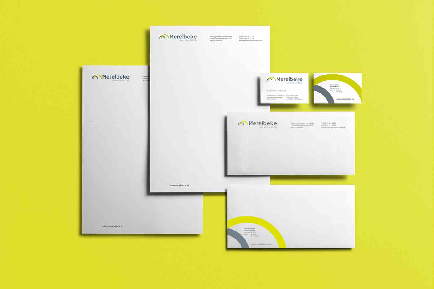
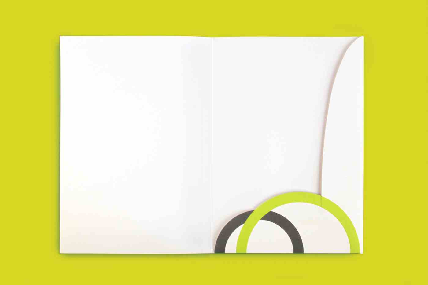
The municipal government of Merelbeke asked us to rebrand their logo and house style. We also provided a new slogan that translates the singularity of the municipality of Merelbeke. ‘Natuurlijk dichtbij’ (Naturally close by) explains the green environment and the very favourable location in a catchy slogan. Fresh green in combination with grey brings together nature and the city.
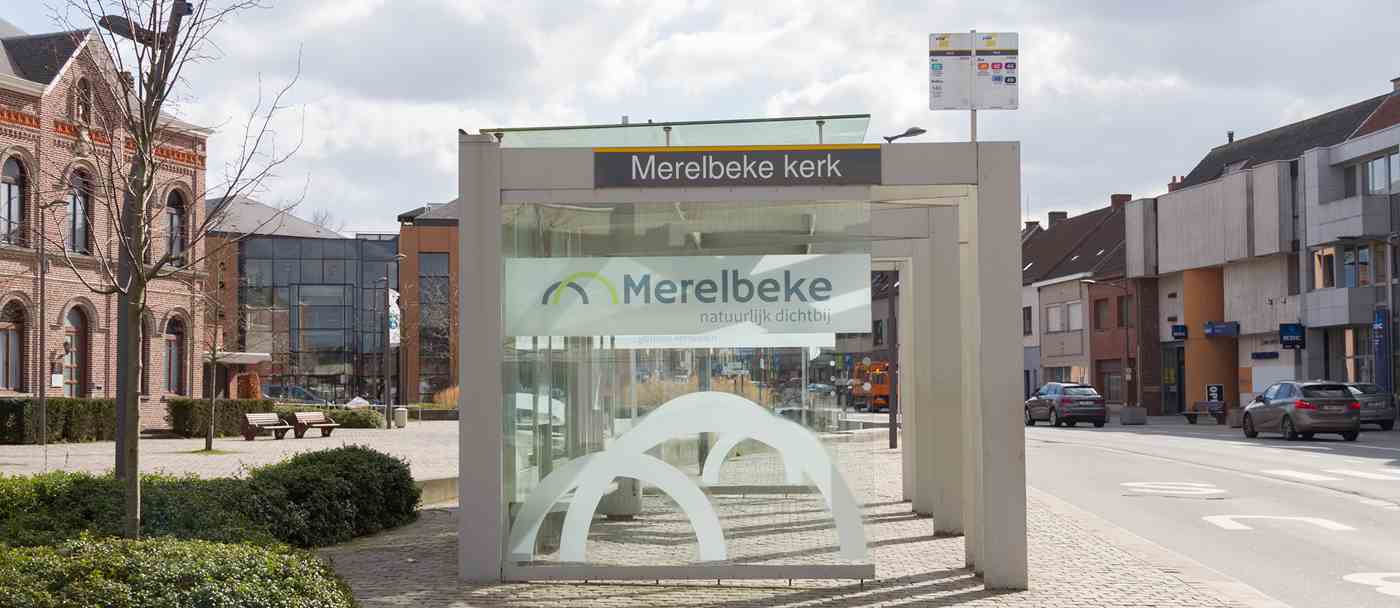
We contributed to clear and strong communication by updating the house style documents, signage, and a practical house style guide.